Bell Canada Admin Redesign
Description
Bell Canada is a Canadian telecommunications company. This redesign focuses on their back-end administrative dashboard.

The Problem
The Solution
Improve the organization and visual appeal of elements while maintaining functionality for a better user experience.
Apply IA frameworks to improve navigation and ensure that the user can navigate between pages successfully and that no pages led to dead-ends.
Roles
UX/UI Design: Collaborative Design, Prototyping, Testing, Iterating
Duration
2 Months
OVERVIEW
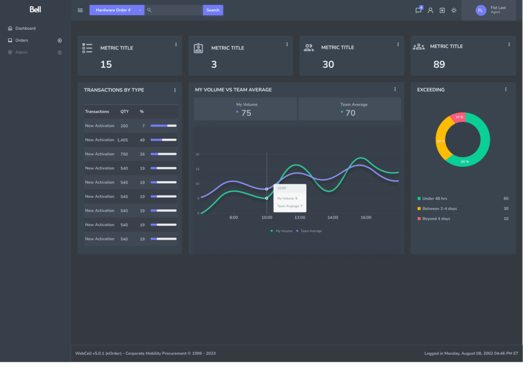
Going into this project, our team first established that the back-end admin dashboard required a visual overhaul. We decided to use the Hyper design system as approved by Bell. The next step was migrating the current elements of their dashboard into the new Hyper system. We wanted to make sure the user was able to quickly find and edit relevant information without deterring too much from the previous design. It still needed to feel like the old dashboard – our job was to make it more visually appealing while improving functionality.
The Old Dashboard
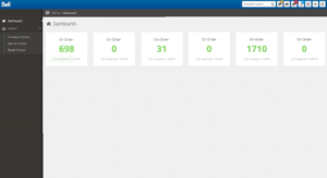
This was the previous dashboard agents saw then they logged on. We compiled some pain points shared by many employees.

“I'm having trouble finding what I want.”

“The information and data could be better organized and displayed.”

“It feels outdated.”
New Dashboard
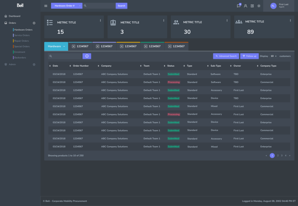
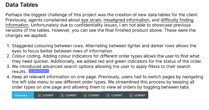
Going Deeper - Data Tables
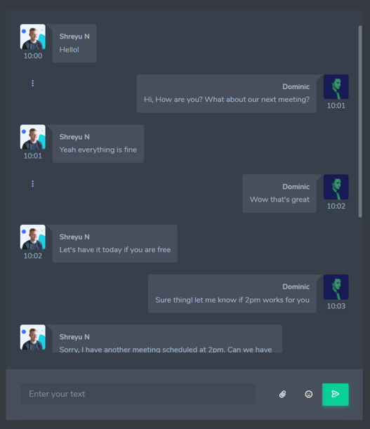
Connecting Users - Chat

CONCLUSIONS & TAKEAWAYS
